With my first intro game of Infinity under my belt, it was time to start painting up some minis but I really struggled to figure out my army colors. I’m playing Yu Jing but yellow just isn’t my color. Nothing wrong with it but it’s not a color I want to paint with all the time or play with. Red is usually my goto but Infinity has a major faction, the Nomads, that studio paint typically red. And my friend already has his Nomads red and I don’t want to confuse things.
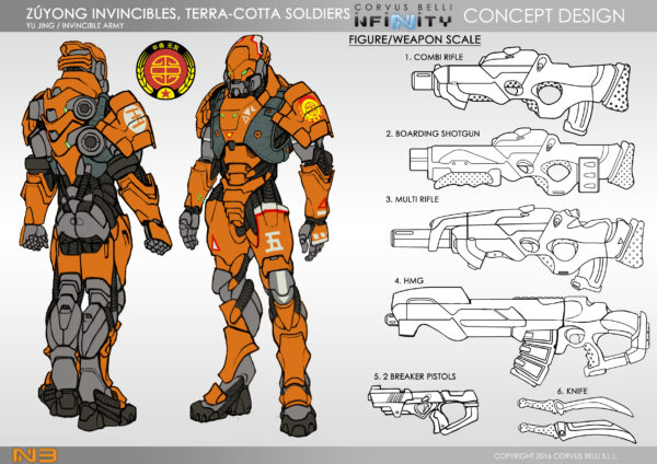
Lucky for me, Corvus Belli released concept art of the figures in an easy illustrated style that I can quickly mess with in Photoshop to see what I like.
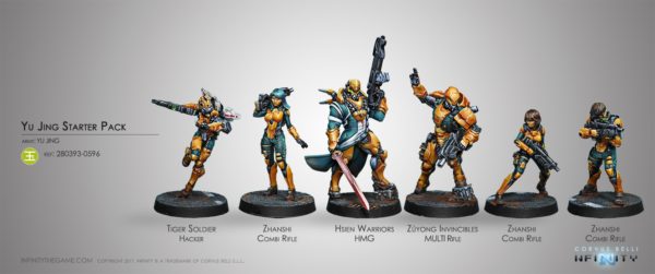
That concept image color isn’t too bad actually. It’s more on the orange side, rather than yellow but looking at the studio-painted models, you can tell they are going for a very golden yellow. That just won’t work for me.
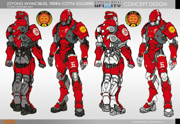
The “replace color” feature in Photoshop got a robust workout here as I started messing with the concept colors. I split the image to have a dark undercloth/armor and a bright white one as this would help me decide to prime the minis dark or light. Here is the red concept. I love red and would totally do this if the Nomads hadn’t already claimed it. I could differentiate with the white under armor but either way, it’d be a lot of confusing red on the table once my friend’s Nomads get painted up.

Though there isn’t much of change here from the orange, I’m really liking this darker color scheme for the main armor. Kind of a sienna color that seems to work really well with the white.

Exploring this further, I brought it even deeper to a drab brown. The white here is critical as it will otherwise just look dark and dirty.
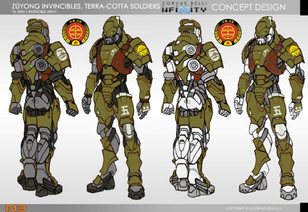
Staying with the drab, I branched away from the warm colors and moved into an olive mix. I really like how different this moves away from the yellow army concept, again with the white contrast. Unfortunately, it starts to go into the Haqqislam’s studio color scheme as well.
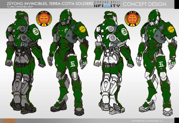
Trying to pull off green, I brighten everything up and find that this can work as a unique scheme for the Yu Jing. It doesn’t track too heavily towards the other factions while remaining unique and decidedly “not yellow.”
Ultimately, though, I keep coming back to that Sienna scheme in white. I really think I can pull that off and it will be unique from the other faction colors but still identify with Yu Jing.
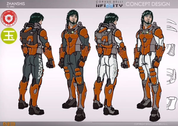
The powersuit armored Terra-Cotta soldiers aren’t the only figures, of course and some have a lot less of the main armor showing so I tried out the concept using the other concept images available. Here is the Zhanshi concept. Again, I like the white so will keep that going throughout the army.
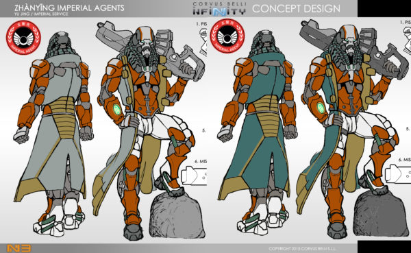
Some of the more flamboyant figures have accented pieces so I needed to determine that color as well. Here, the Zhanying have an accented overcoat. Ultimately, I didn’t stray too far from the studio accent color on this and went with that teal/sea green accent that works well with the dark, warm armor. I lightened it up from the studio concept since I darkened the armor choice.

I went back and added in the accent to the original Terr-Cotta soldier and I’m really excited for the army scheme. Now I just need to prime things up and get to work.
